Dove.com
A complete redesign of Dove.com.
We were tasked to redesign current and create net new templates for Dove.com, utilizing their new brand font and incorporating more of their secondary colors. On top of modernizing their site, we updated their site structure to allow for more growth and to balance both their product and social activism goals. The new design was tested to meet brand accessibility standards and to ease transition of current image libraries into the new templates.
From initial style explorations to final release, this refresh was designed, developed and deployed within a year — an impressive feat for a long-standing and sprawling site.
Role: Product Design, Art Direction
Dove.com Sizzle Reel - Password: 4YourEyesOnly
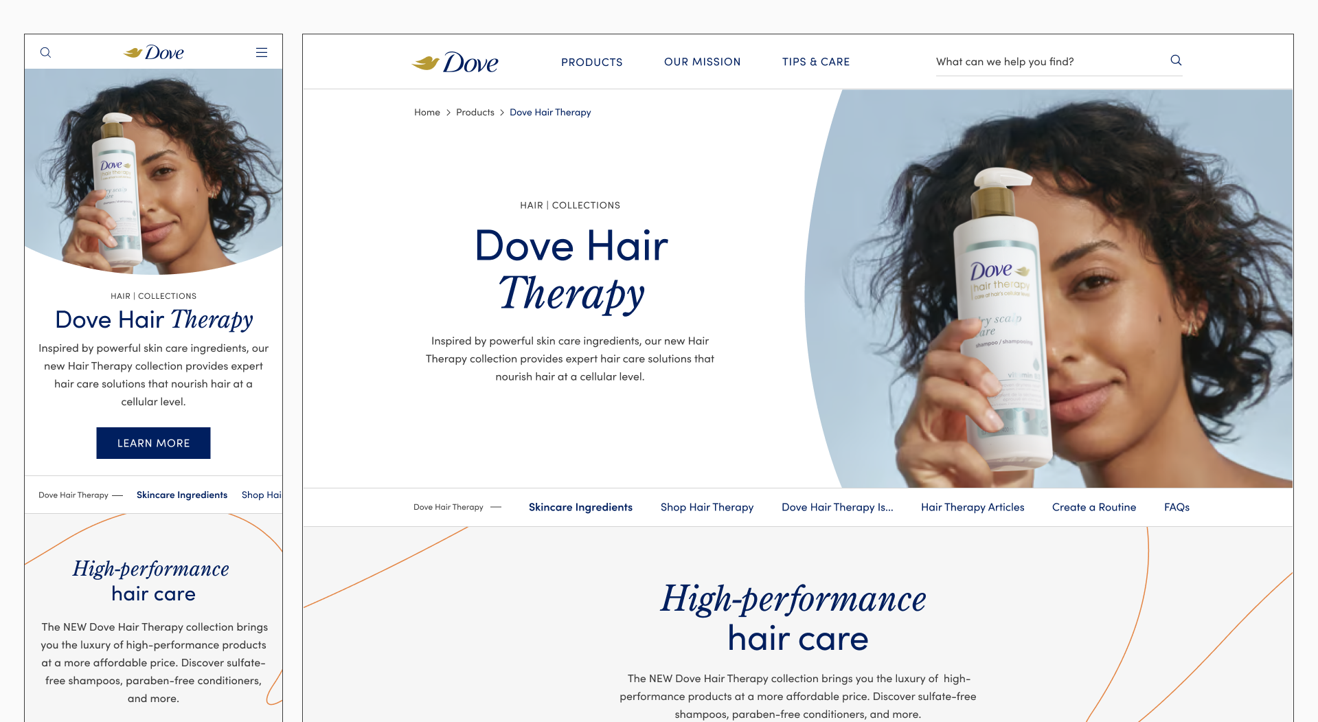
Dove.com Design System
Completely new design system and style guide, providing branding guidance such as typography, color, imagery and tone of voice, as well as detailed component annotations.

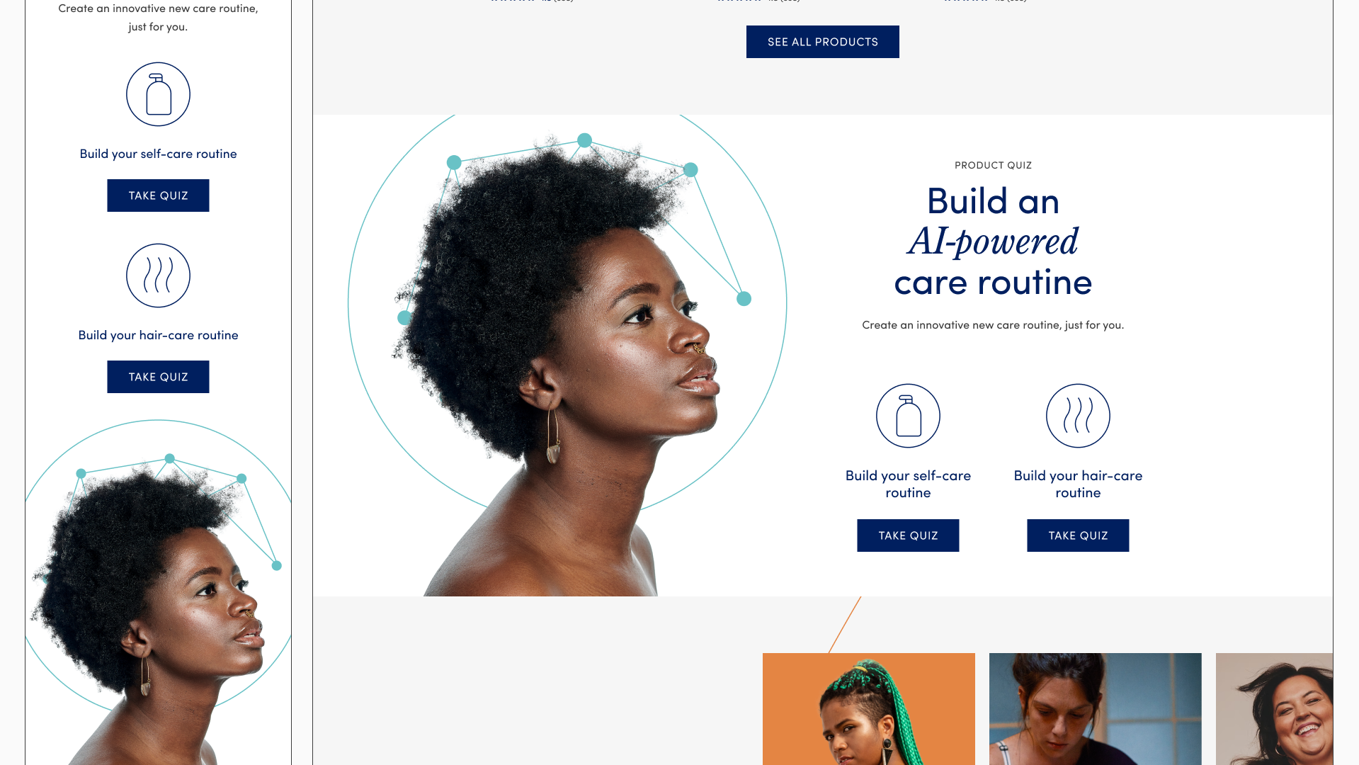
Fully responsive design
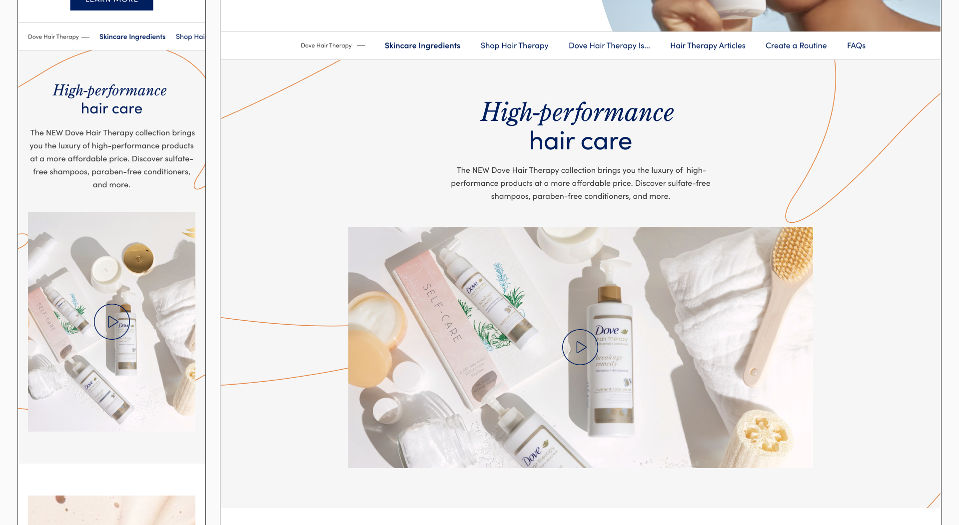
The entire site was updated, refreshing current templates including Homepage, Product Landing and Detail pages, Article pages, etc. as well as introducing new templates such as Mission Landing and Detail pages, Product Campaign pages, etc.

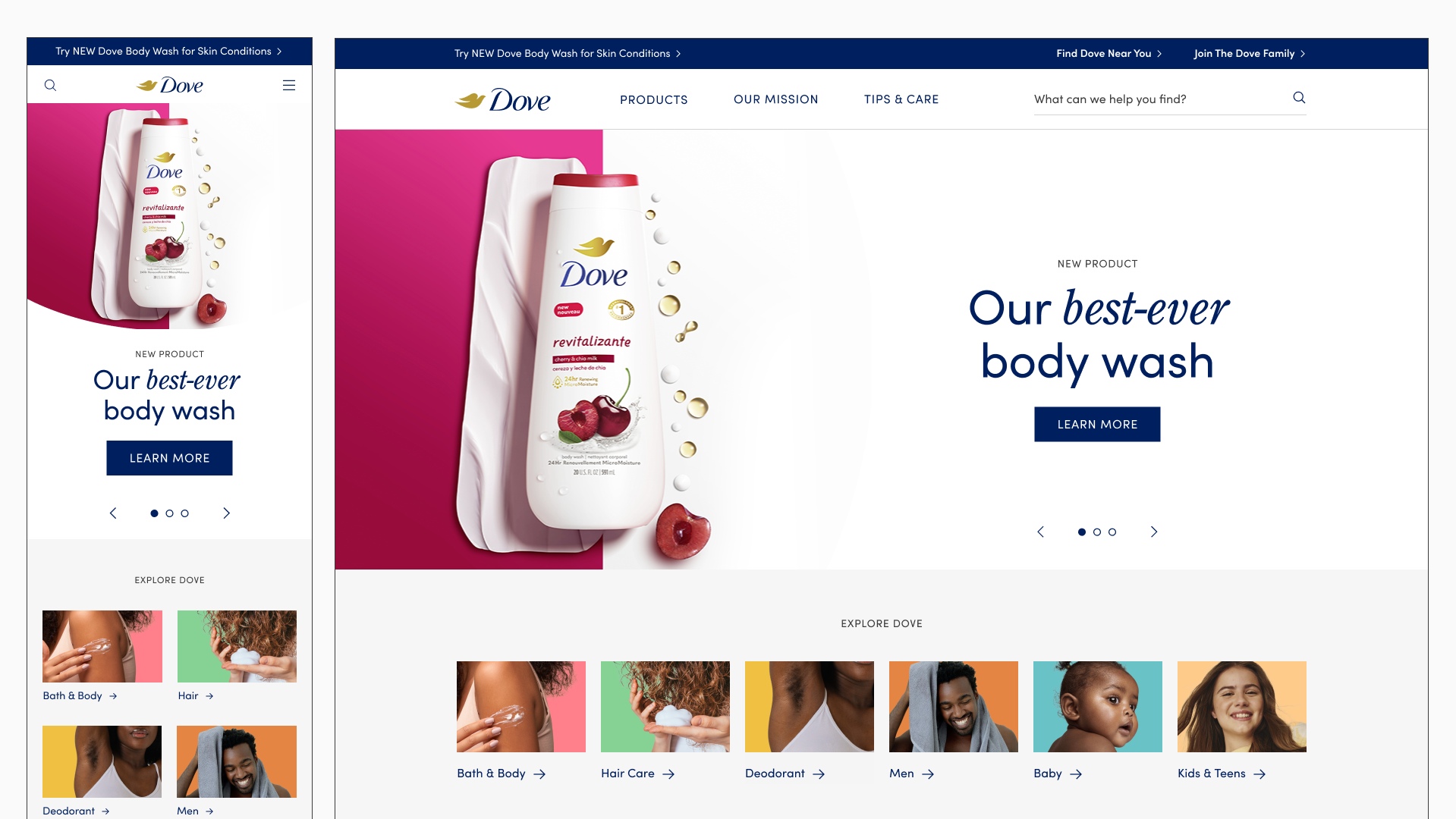
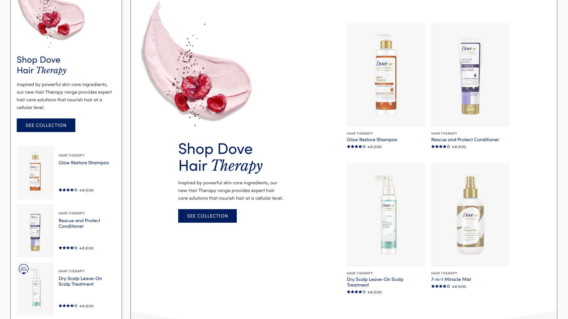
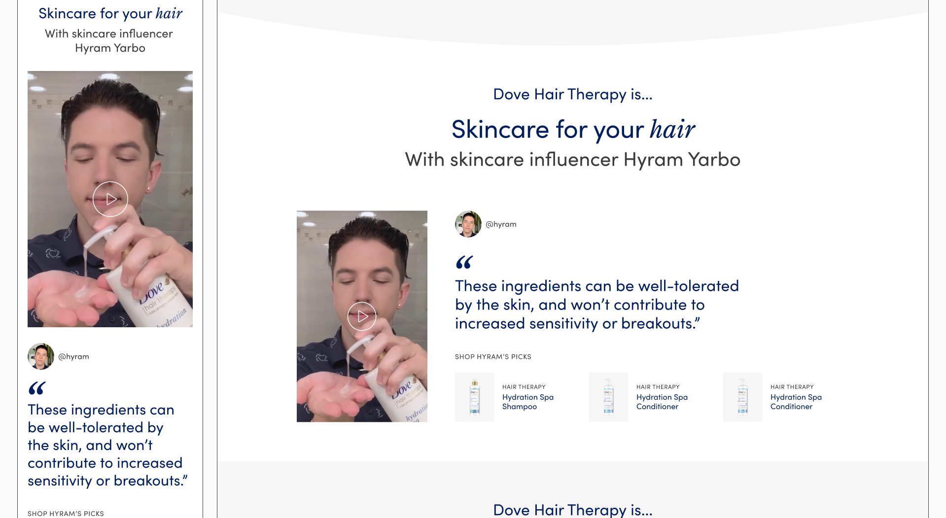
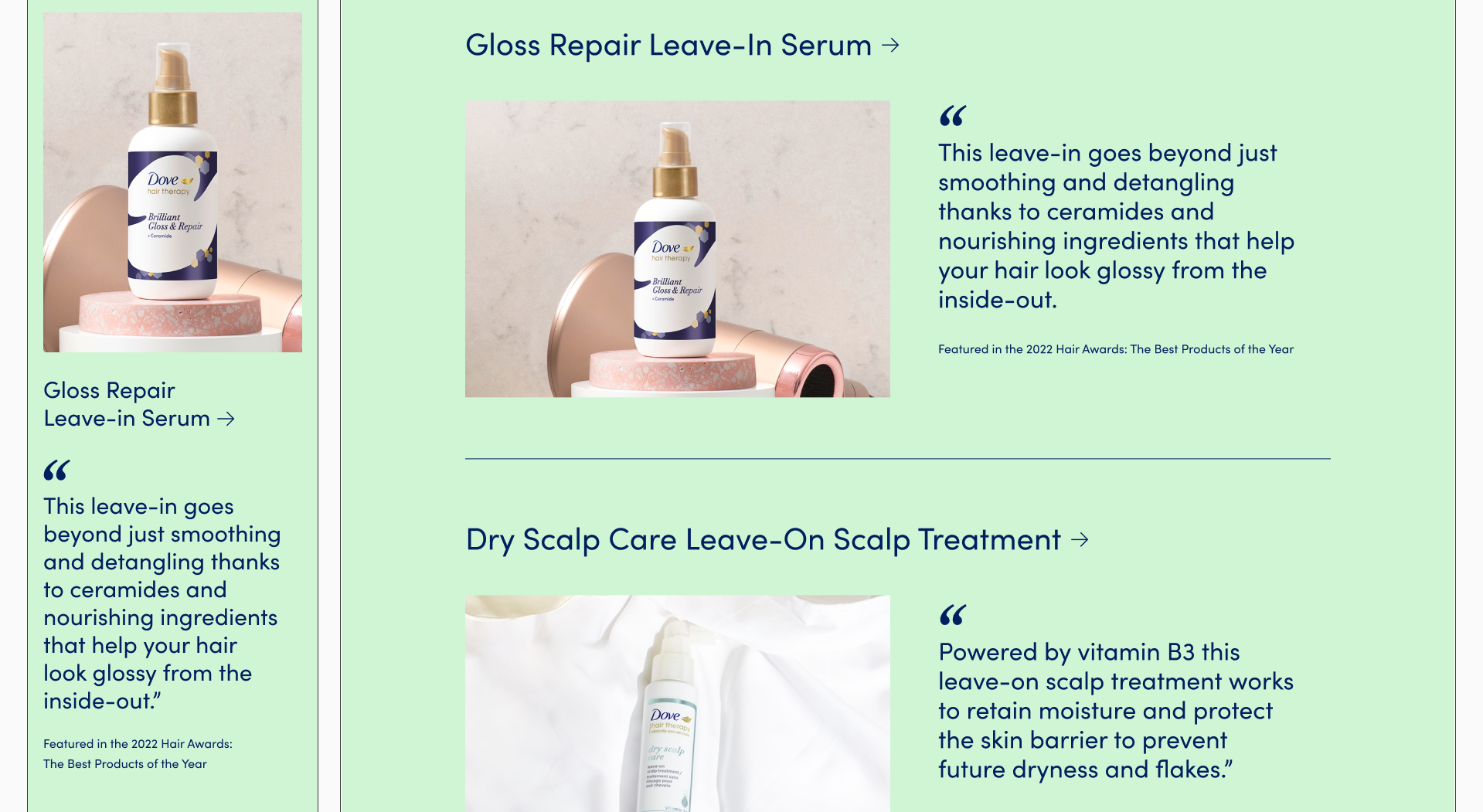
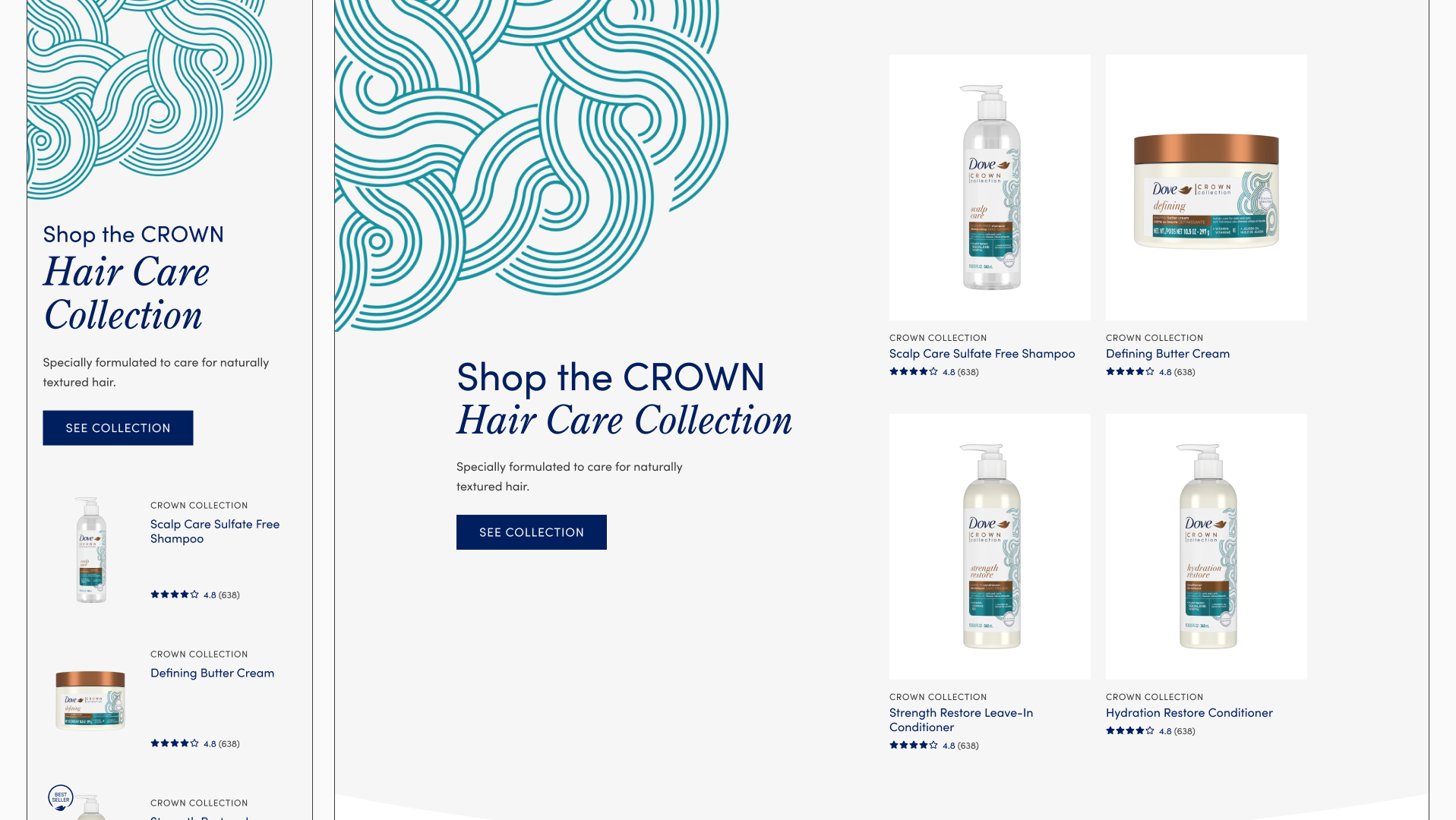
Product Campaign Template
New template to feature products, focused on injecting user generated content and media.
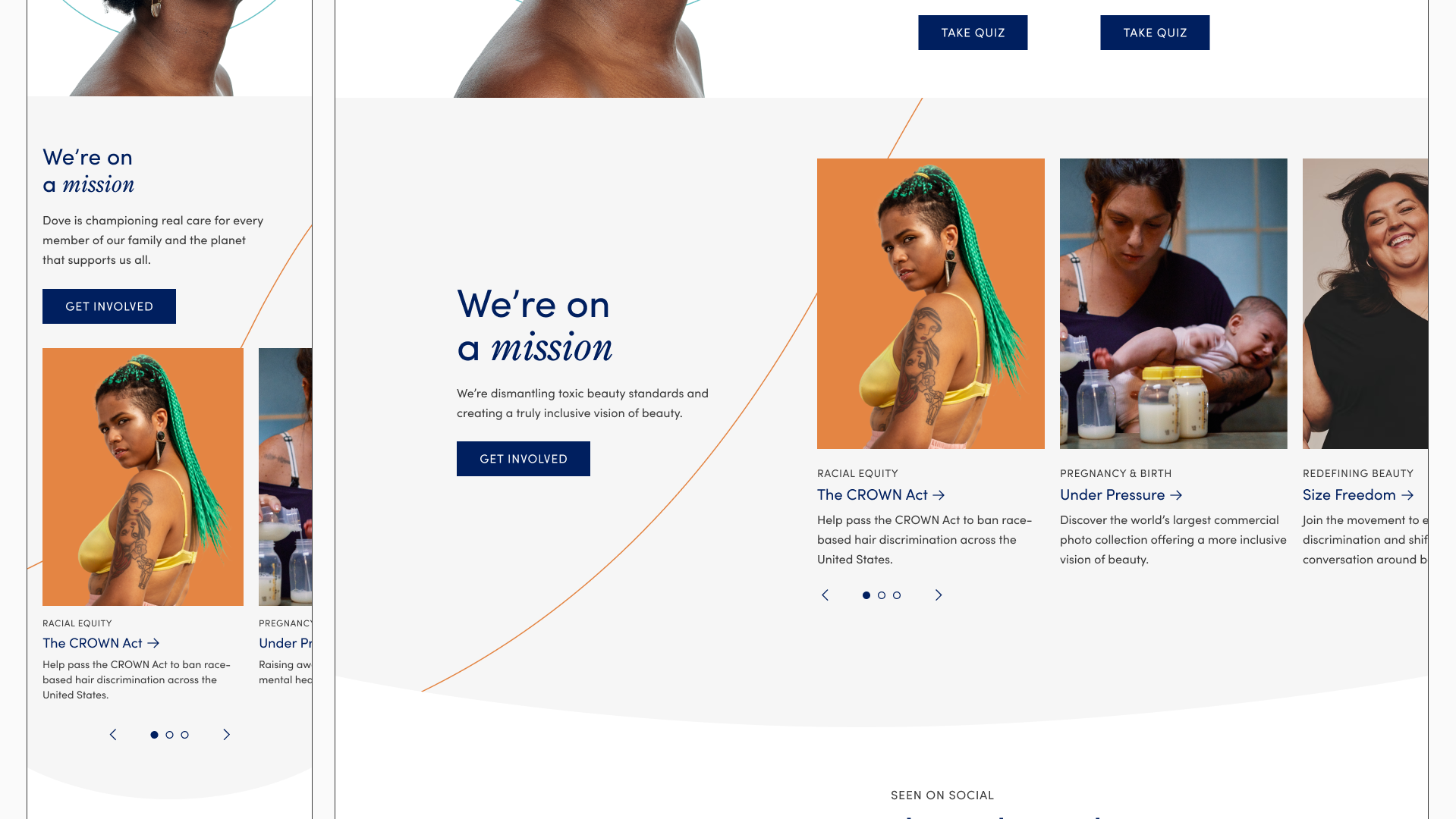
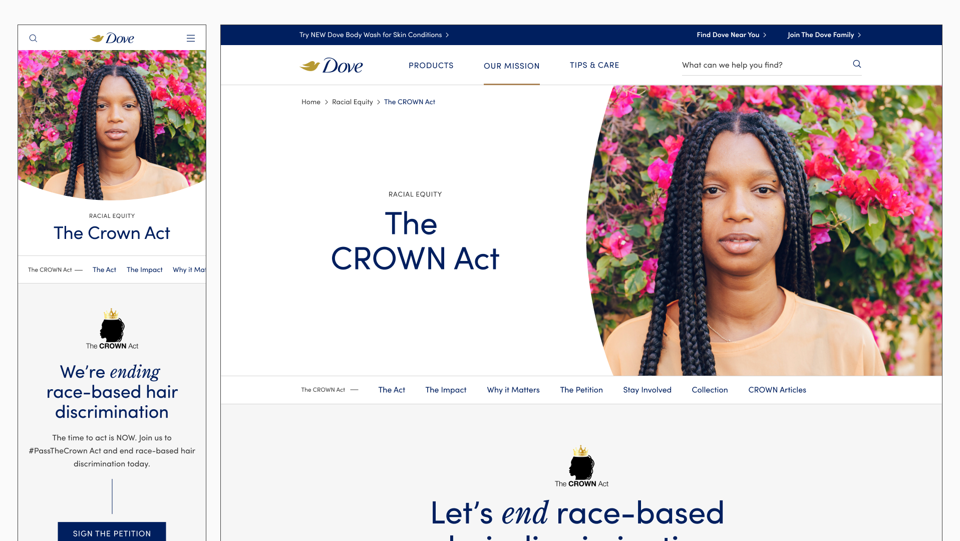
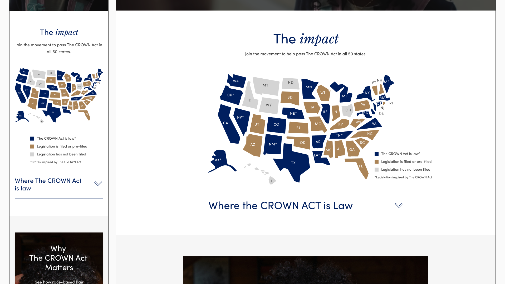
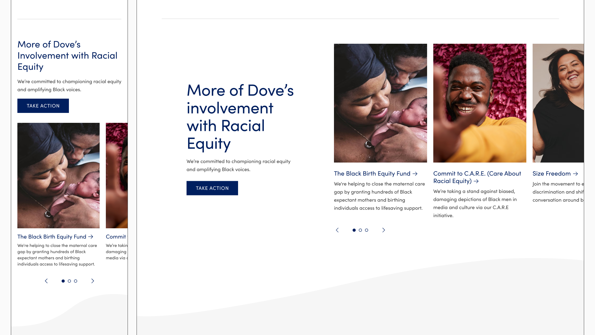
Mission Campaign Template
New template to house all social campaign content
Consolidated Site Design
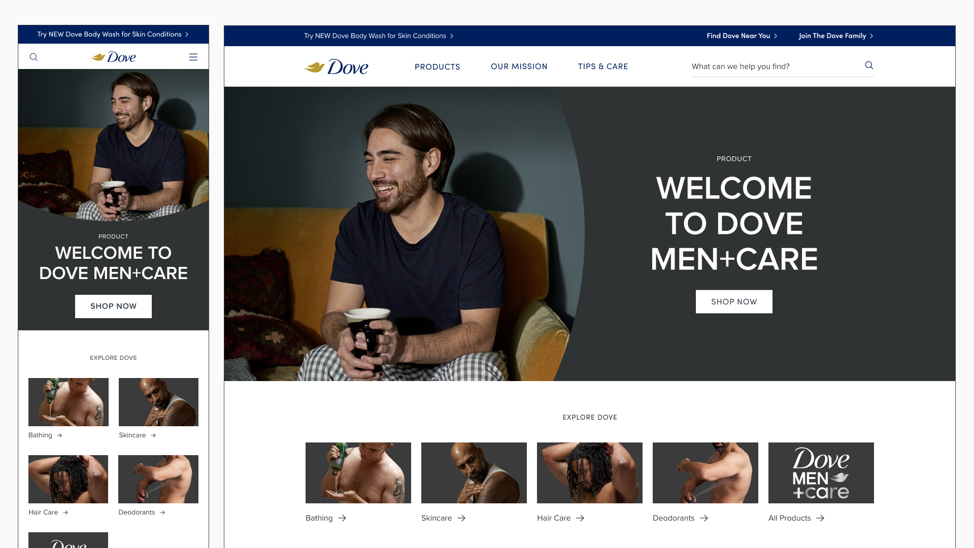
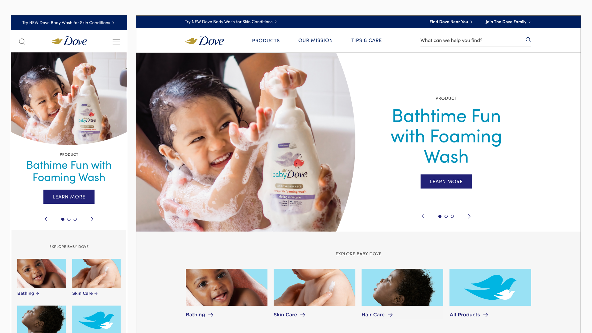
Standardized design across Dove Men+Care and Baby Dove, created a unified design language across all of Dove.com